10 Awesome Evolutions Of Famous Logos
Celebrity, Design, Digital Art, Drawing, Entertainment, Funny, Illustration, Lists, Other, Technology, WeirdEverything in this world has evolved and is constantly in a form of evolution. This is especially true with modern day technology and the impact it has on humans as a species, with some scientists believing that with the progression of technology, this is the fastest that the human race has ever evolved. So, while it may or may not hold true for people, it certainly holds true for major companies. Not only are companies evolving, so are their image, as can be seen in this list of ten hilarious evolutions of famous logos.
This is a classic case of simplifying logos in an attempt to more easily imprint into the consumer’s mind. It seems it has worked as this is one of the most easily recognized logos ever to be created, as opposed to the original.
Walt Disney
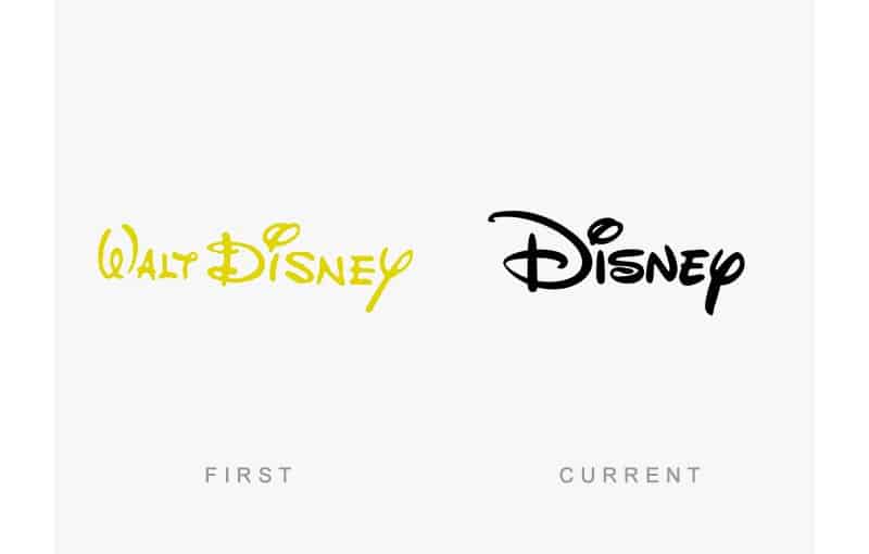
With the passing of Walt, the Disney brand seems to have taken a hit as brazenly as with the logo.
Firefox
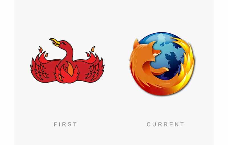
The Phoenix from the original logo looks nothing like a fox, luckily Mozilla changed it to the popular logo it has become now.
Pepsi
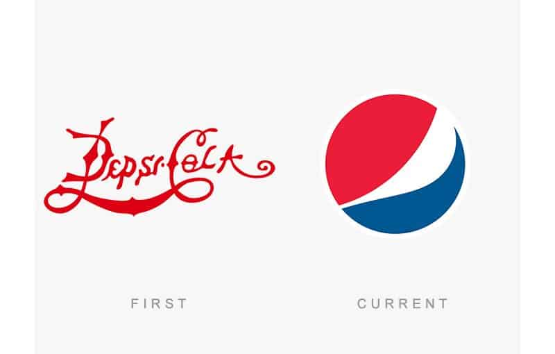
The original logo is old school cool, whilst the new logo looks like the back end of a fat person with the pants drooping down. Maybe this wasn’t the best logo choice.
Audi
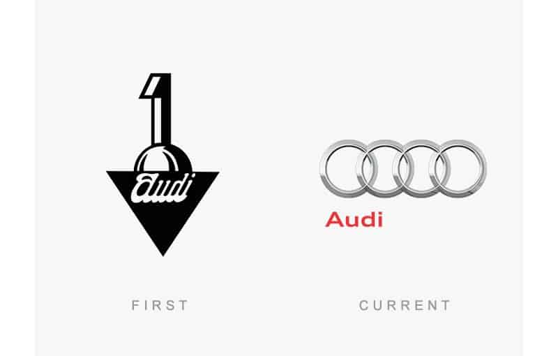
Back when Audi brazenly believed to be number one, they even went as far as putting a number one above their name.
Volkswagen
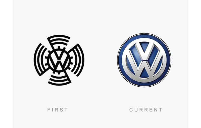
Luckily Volkswagen quickly changed their logo to the new one once the Nazi force was defeated.
Nokia
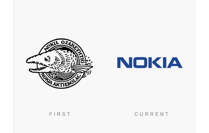
This current logo is the one that everyone and their grandmother is familiar with, whilst the original logo seems to be bizarre beyond logic.
Apple
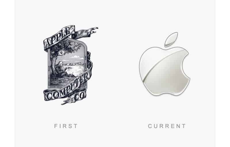
Again following with the popular trend of simplistic is best, Apple changed their beautiful original logo for the half eaten apple that currently exists.
Burger King
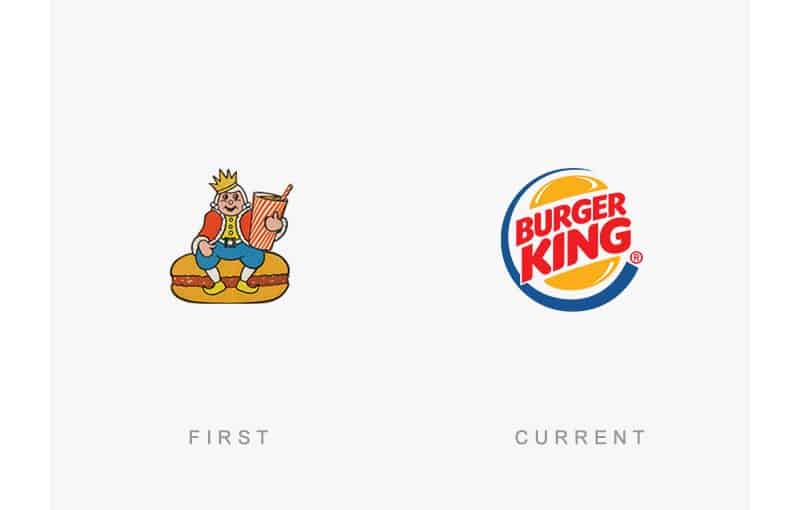
Although the most current logo is the most popular and recognizable of the two, the original makes the most sense, with the king sitting on his burger throne.
Heineken
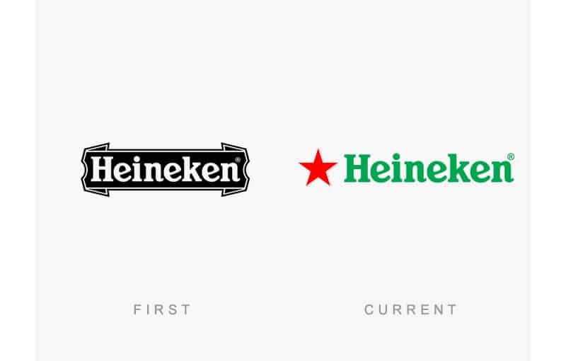
As with all good things, it seems the Heineken logo stuck as close to the original as possible in an attempt to prevent alienating their customers.