10 Brand Logos That Send The Wrong Message
Design, Digital Art, Drawing, Entertainment, Funny, Lists, Optical Illusions, Other, Shocking, WeirdLogo design is one of the most vital elements of building a corporate brand. Most of the brands we love today would be nothing without their logo. With businesses worldwide recognizing the importance of the logo in the image of the brand, it’s no wonder that a number of businesses and individuals have managed to make millions in the industry of logo design. However, as with most items that are closely related to art, logos are also subjective and could be perceived in a number of different ways depending on the person who is judging the design. While the following 10 logos are quite creative in their own manner, we can’t help but see that the majority of you will get the wrong message for the companies they represent, if you look just at the logo.
The Computer Doctors
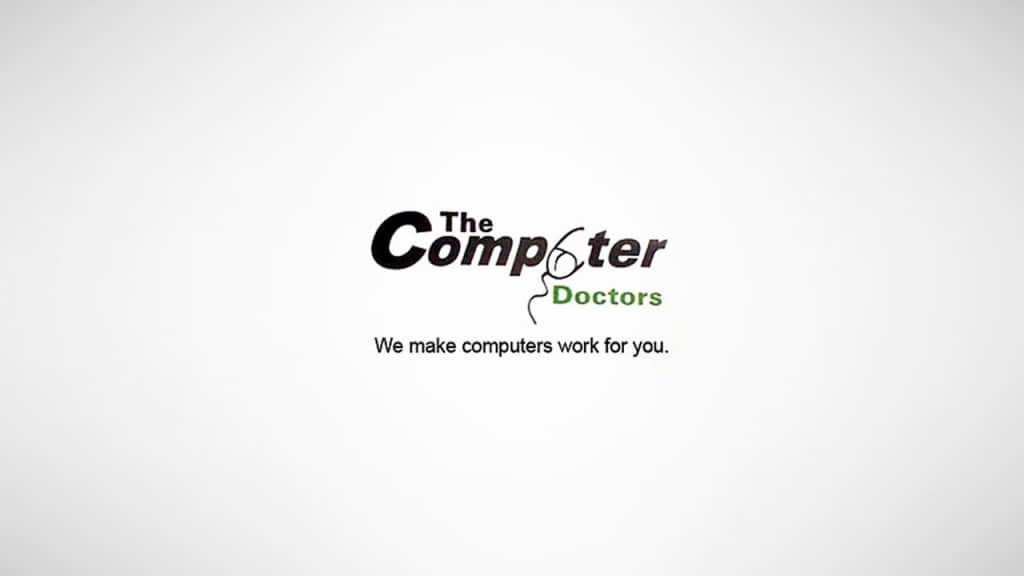
Quite self-explanatory, the mistake in this logo is easily seen. Some could even wonder, if these computer doctors only fix your computers.
Vermont Maple Syrup
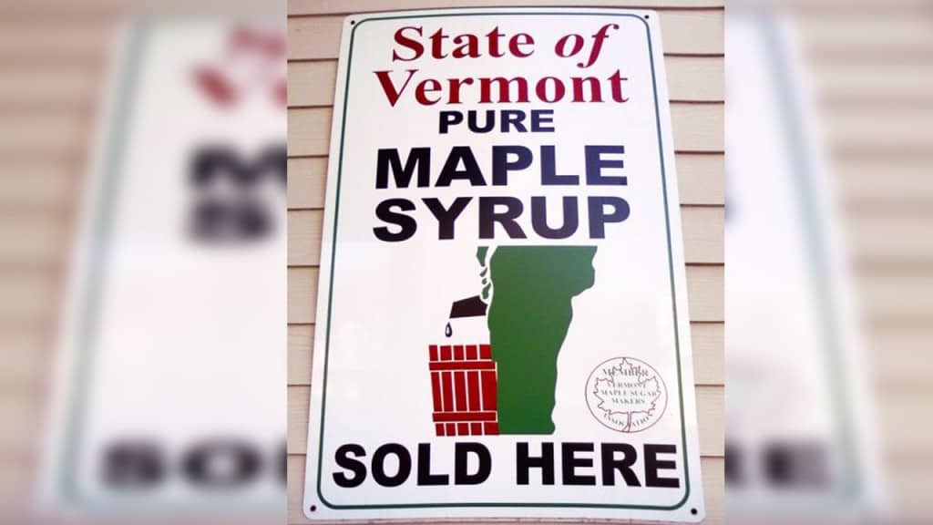
Showing the state of Vermont in its glorious geographic beauty, this logo reveals a bit too much. However, it truly does show where the pure maple syrup comes from.
Kudawara Pharmacy
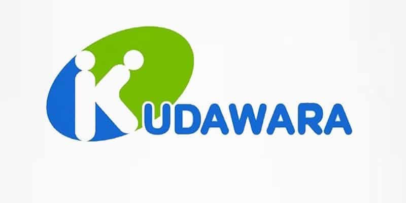
Used by a Japanese pharmacy called Kudawara, this logo is supposed to be the letter K. However, we can’t help but see two little figures doing the deed.
Mama’s Baking
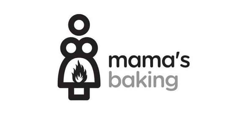
This Greek café has a major Oedipus complex, if you perceive the brand by its logo.
Locum
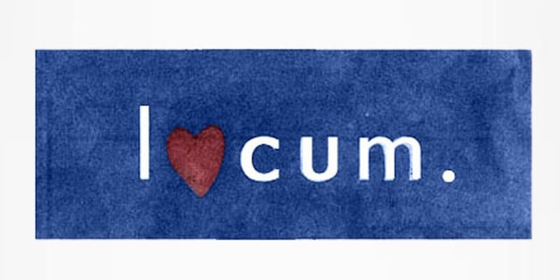
A Swedish property management company, Locum stands out with a truly creative logo, where they’ve changed the letter ‘o,’ to a heart. However, this way we can read something far different than what the logo should represent.
Mont-Sat
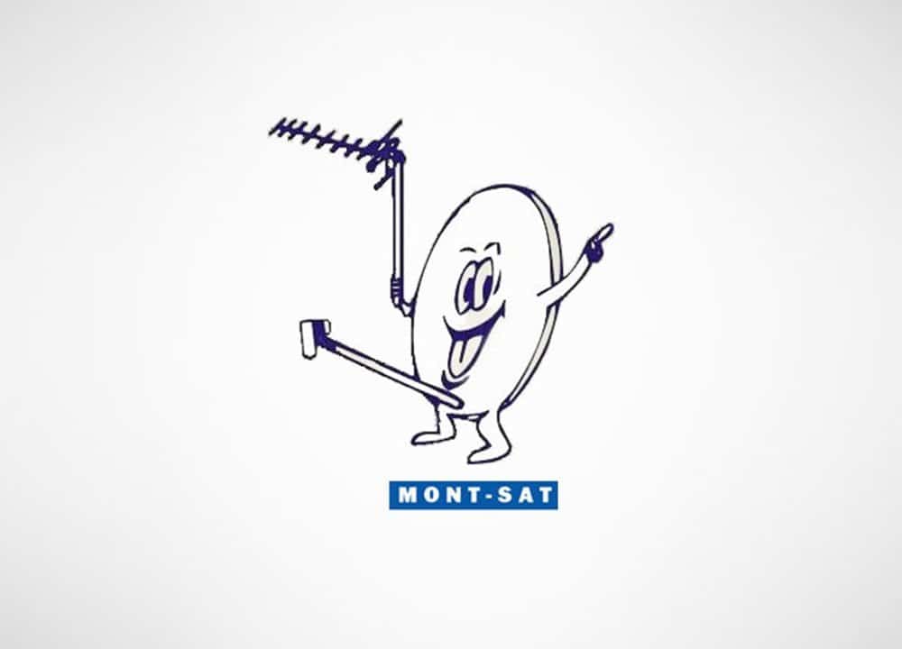
A company offering digital satellite television, Mont-Sat are quite happy and proud with what they represent.
Sherwin WIlliams
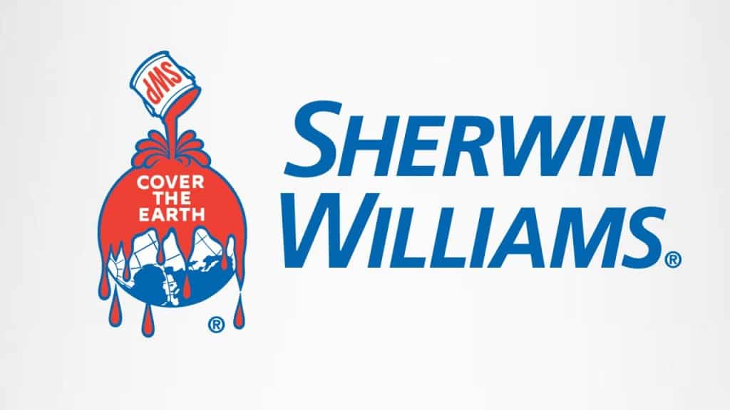
One of the worst logo fails in recorded history is that of Sherwin Williams, who made a logo for the ‘cover the earth’ movement of Coca-Cola, which had the purpose of teaching the world to sing. However, the logo reveals other, more sinister desires.
Sun Rise Sushi
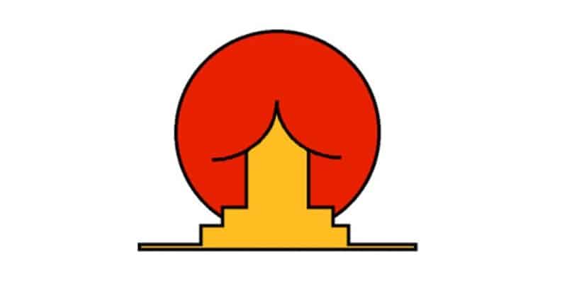
Hilarious in its own way, this logo is supposed to represent a Japanese tea house called Sun Rise Sushi. While the design of a house in front of the rising sun is clearly seen, we can also see something else.
Arlington Pediatric Center
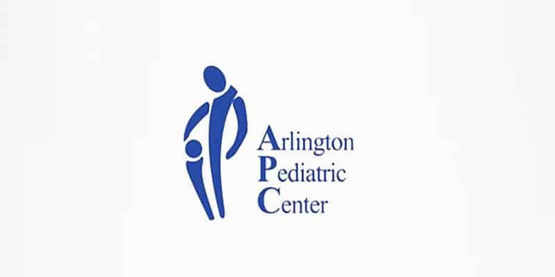
This logo is supposed to represent how much the doctors are taking care of the children in the Arlington Pediatric Center. However, they might also be taking advantage of them!
London 2012
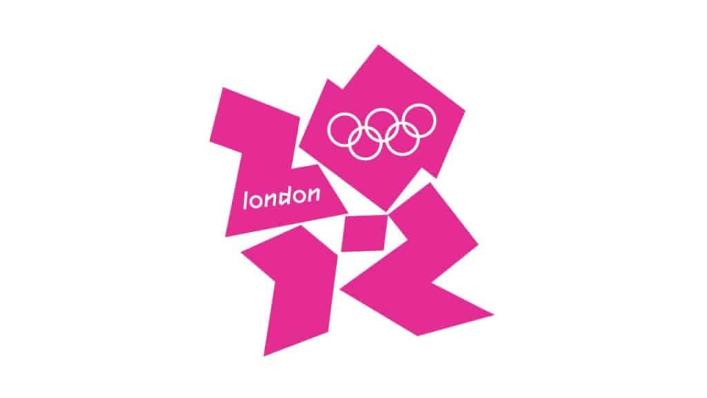
Another logo fail we’ll always remember is the one of the London’s 2012 Olympics. While some can clearly see Lisa Simpsons in it, others can’t help but see a woman on her knees, performing felatio on a man.